
In keeping with their overarching theme “Time is Gold”, Bvlgari’s offerings during LVMH Watch Week focused heavily on watches in gold. The marque has unveiled numerous additions to the Bvlgari Bvlgari collection and the Lvcea line, as well as two new editions to the Octo Finissimo family. Jean-Christophe Babin, CEO of Bvlgari, sat down with us to elaborate on the new watches
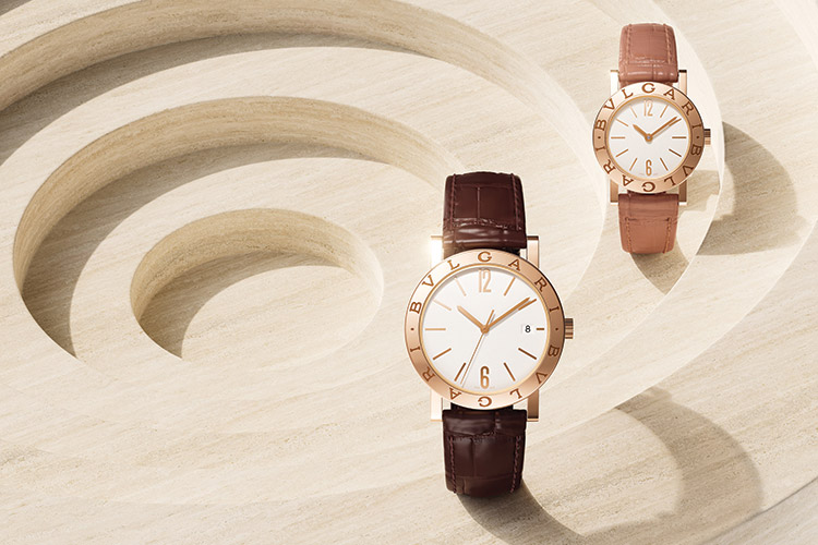
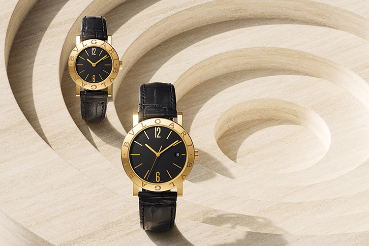
Bvlgari Bvlgari has been an icon for the brand when it was launched in 1975 and, even now, it is still an icon; why do you think that is?
Bvlgari Bvlgari was born from the idea of the Imperial Roman coin, which is universally famous, because the Romans were minting a lot of coins with traditionally the emperor’s name on the edge, and the face of the emperor in the middle. Bvlgari Bvlgari has, this time, designed a watch that is a modern expression of the coin, and instead of the emperor’s name we have Bvlgari Bvlgari, and the face obviously had to be a watch face. This makes this watch immediately legitimate and familiar even though it is extrapolated from the coin. But those imperial coins are very unique in their construction, then and now.
We are the first and remain, even today, the only brand with a logo on a watch in the luxury watch market. If you look at fashion for instance, you have logos everywhere. We are the only brand that has ever maintained with success a logo watch in its collection and the fact that it is round, it is a logo and not just a free-standing exercise, but reminiscent of our roots in imperial coins minted 2,000 years ago provides this watch with a timeless legitimacy, which makes it as contemporary today as it was when it was born in 1975.
If you see the original 1975 one and the current edition, there are some differences, but in general it is the same. Of course, there are differences because obviously in these many years the quality standards have evolved a lot. We have also moved through various movements to welcome a mechanical movement, and now our in-house “solotempo” movement. We have made the overall design even more balanced than the initial one in terms of relationship between the diameter and the thickness of the case band. So, though it looks very similar, there is not even a screw in common with the original design, but you cannot see this immediately.
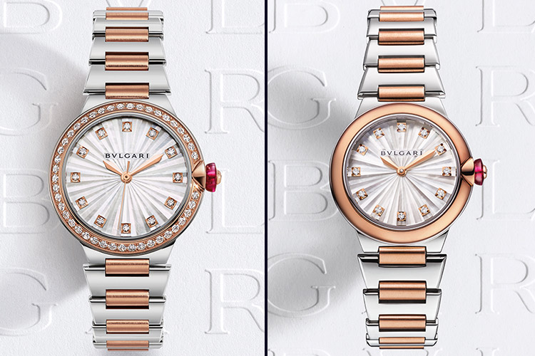
Originally, the Bvlgari Bvlgari was 26 mm and now you have the 38mm; why the change in size?
Actually, we still have 26mm. We now have 23mm, 26mm, 36mm, and 38mm. We have to acknowledge that markets are different and that our clients’ physical sizes are different as well. Typically, 26 mm could be a bit too big for a Japanese lady, hence the 23mm. In America, conversely, most ladies probably will go straight to the 38mm because they like slightly bigger watches. Today, if you want to compete globally and resonate internationally, you cannot stick to one-size-fits-all philosophy, especially in watches. It is a bit easier in jewellery because when you design a pendant, this approach works to some extent. If it is for a chain, it can be longer or shorter ones, and a pendant is a pendant.
For watches and for rings, we have to acknowledge that our bodies are different and that in terms of styling and size, this is extraordinarily important. Also, we should not forget that watches really are accessories, and they are accessories to an overall style. So, the fitting is foremost, and we really have to acknowledge that our clients are different and that in some markets larger diameters may be needed. For instance, in rings, in some countries, the best-selling size is 48, while in other countries it is 54. That means we also need sizes 51, 52, and 53 to make sure that we offer a perfect fit to our customers. Not too tight that it is uncomfortable, nor too loose that you are in danger of losing it.
Can you tell us about the dial of the new Bvlgari Bvlgari x Lisa collaboration, as it is a very unique one?
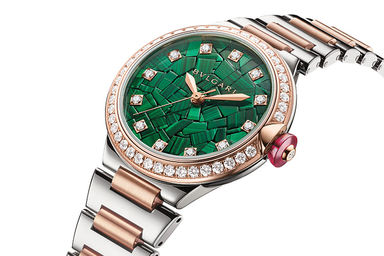
As I mentioned earlier, the roots of Bvlgari are Roman, and in Rome they not only had imperial coins as currency, but they had a lot of mosaics. This watch has a mosaic dial, which is a miracle of craftsmanship. It is actually assembled piece by piece. And it took a lot of time and effort to turn the idea into reality. When you see this dial and the Lvcea, you will notice that we are making our dials more precious in terms of craftsmanship so that they are totally different from the dials of our competitors while also being very beautiful. There are other brands with malachite dials, but not with this combination with a different kind of marquetry. The same thing goes for the mosaic; very few brands feature mosaic dials, and this is obviously requires intensive craftsmanship. On the other hand, differentiation and Roman legitimacy are highly important to us and that is something we cannot compromise with.
Can you tell us about the new Octo Finissimo Tuscan Copper; why a Tuscan copper dial?
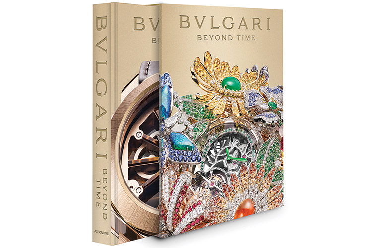
The Octo Finissimo is what we would define as the S model for sport because it is waterproof up to 200 metres. The dial looks like a lighter version of a salmon dial. Our current bestseller is the blue edition that we introduced three years ago. We wanted another colour that is a departure from the traditional black or silver dials because most men watches are black and silver. We have those as well, but we would like to focus on colours – colours that resonate with our mastery of colour perception and positioning stemming from our jewellery background and expertise. If one brand can truly be successful with unexpected colours, even in men’s watches, it is Bvlgari – mainly because we have that patrimony; when people think Bvlgari, they think colours. Look at the cover of our coffee-table book “Bvlgari: Beyond Time”; it is just an explosion of colours.
In developing the Octo Finnisimo, on the one hand, we had to further improve our macro mechanical expertise and apply it to a watch that already has seven world records. On the other hand, we had to leverage the Supercar into a GT car with the S model providing it also with different choices of dials. We cannot aspire to become a mainstream men’s watch brand, if we have only a blue dial. The blue dial is obviously very important and therefore we have introduced it again this year in the yellow gold also. It provides a beautiful contrast. The yellow provides an even starker contrast than with steel or with rose gold, just because the two colours are very strong and, being strong, they make for an immensely strong watch in terms of pedigree when put together.